A responsive website has become a necessity. With the increasing number of internet users accessing websites through different devices, a website that is not responsive can lead to a poor user experience and lower engagement. Responsive website design and development ensures that your website looks great and functions properly on any device, including desktops, laptops, tablets, and smartphones. Responsive website design and development is, why it’s important, and how it works.
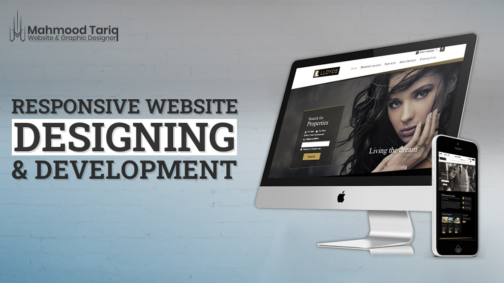
What is a Responsive Website?
A responsive website is an approach to building websites that adapts to the size of the user’s device screen. It involves creating a website that can respond to the user’s device by adjusting the layout, content, and images to fit the screen size. The goal of responsive website design and development is to create a website that looks great and functions optimally on any device, regardless of the screen size.
The history of responsive web design dates back to 2010 when Ethan Marcotte coined the term “responsive web design” in his article “Responsive Web Design” for A List Apart. He explained that responsive design involves using flexible layouts, fluid grids, and media queries to create a website that adapts to different screen sizes. Since then, responsive web design has become an industry standard, and many businesses and organizations have adopted this approach to create websites that work well on any device.
Why are Responsive Websites Important?
Responsive websites are important for several reasons. First and foremost, it enhances the user experience by making the website easy to navigate and read on any device. A responsive website can improve user engagement, reduce bounce rates, and increase the time spent on the site. Additionally, responsive design can improve search engine optimization (SEO) by making it easier for search engines to crawl and index your website.
Here are some of the key benefits of a responsive website:
- Improved User Experience: The most significant advantage of responsive website design and development is that it improves the user experience. A website that is not optimized for different devices can be challenging to navigate and read. Users may need to pinch and zoom to view content, making it frustrating and difficult to use. A responsive website, on the other hand, adjusts to the user’s device, making it easy to read and navigate. This leads to a better user experience, improved engagement, and increased time spent on the site.
- Better Search Engine Optimization (SEO): Search engines like Google and Bing use algorithms to rank websites based on various factors, including page speed, user experience, and content quality. A responsive website can improve your search engine ranking by providing a better user experience, faster page load times, and mobile-friendliness. Additionally, a responsive website reduces the need for separate desktop and mobile versions, making it easier for search engines to crawl and index your website.
- Cost-Effective: Building separate websites for different devices can be costly and time-consuming. Responsive website design and development, on the other hand, requires only one website that adapts to different screen sizes. This makes it a cost-effective solution for businesses and organizations that want to reach a wider audience without breaking the bank.
- Increased Conversion Rates: A responsive website can also lead to increased conversion rates. Users are more likely to engage with a website that is easy to use and navigate, leading to higher conversion rates. A responsive website can also improve the user experience of e-commerce websites, making it easier for users to browse products and make purchases.
How Does Responsive Website Designing and Development Work?
Responsive website design and development typically involves the use of flexible layouts, images, and cascading style sheets (CSS) that adjust to the user’s device screen size. This is achieved through a combination of fluid grids and media queries. Fluid grids allow website elements to resize proportionally based on the size of the user’s device screen. Media queries are used to detect the device screen size and apply specific CSS rules to adapt the layout and content accordingly.
Responsive website design and development also involve optimizing website images for different devices. Images that are too large can slow down page load times and reduce user engagement. Optimizing images for different device sizes can improve page load times and reduce data usage.
Responsive website design and development Services is essential for creating websites that look great and function properly on any device. It improves the user experience, reduces bounce rates, and can improve search engine optimization. By using fluid grids, media queries, and optimized images, responsive website design and development ensures that your website is accessible to all users, regardless of the device they’re using.
If you’re looking to create a new website or update an existing one, responsive design should be a top priority. Contact me today. I can help you grow your business online.